Design is not just about making things look good; it’s about communicating a message effectively. Whether it’s a website, a poster, or a product, good design should be able to convey a message clearly and intuitively. One of the key elements of good design is composition, which refers to the arrangement of visual elements in a design.
Composition is the foundation of all good design. It is the key to creating balance, harmony, and unity in a design. A well-composed design will draw the viewer’s eye to the most important elements, guiding them through the design and helping them to understand the message.
When designing, it’s important to consider the hierarchy of visual elements. The most important elements should be the largest and most prominent, while less important elements should be smaller and more subtle. This hierarchy can be established through size, color, contrast, or other visual cues.
Another important aspect of composition is whitespace, or negative space. Whitespace refers to the areas in a design that are left blank, without any visual elements. Whitespace is important because it helps to create balance and contrast in a design, and it can also help to emphasize important elements.
As designer Paul Rand once said, “Design is so simple, that’s why it’s so complicated.” The best designs are often the simplest, but creating a simple and effective design is not always easy. It requires careful consideration of composition, hierarchy, and whitespace, as well as a deep understanding of the message that the design is trying to convey.
In conclusion, composition is the key to good design. It is the foundation upon which all other elements of design are built. By understanding the principles of composition, designers can create effective and impactful designs that communicate a message clearly and intuitively. So, next time you’re working on a design project, remember that composition is the key to success.
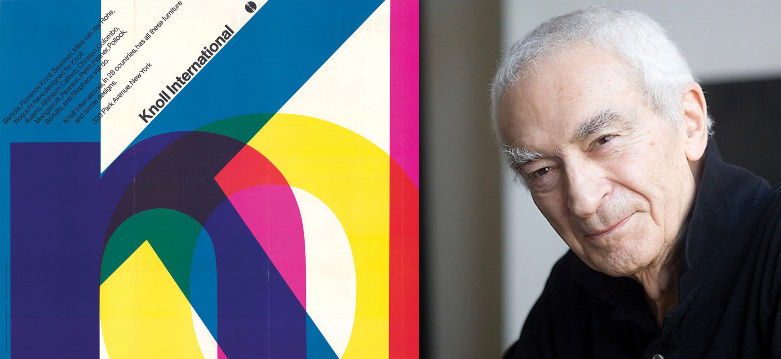
Here’s a quote from the famous graphic designer, Massimo Vignelli, that highlights the importance of composition in design:
“Design is one. If you can design one thing, you can design everything. Just observe how we live, how we communicate, how we behave, how we make love, how we sing, how we cry, how we are afraid. Everything we do is design. Everything!”
This quote emphasizes the idea that design is not just about aesthetics, but it’s also about the way we live and communicate. It’s about how we arrange elements to create a visual language that speaks to people in a clear and effective way. By understanding composition, designers can create designs that not only look good but also effectively communicate a message.


